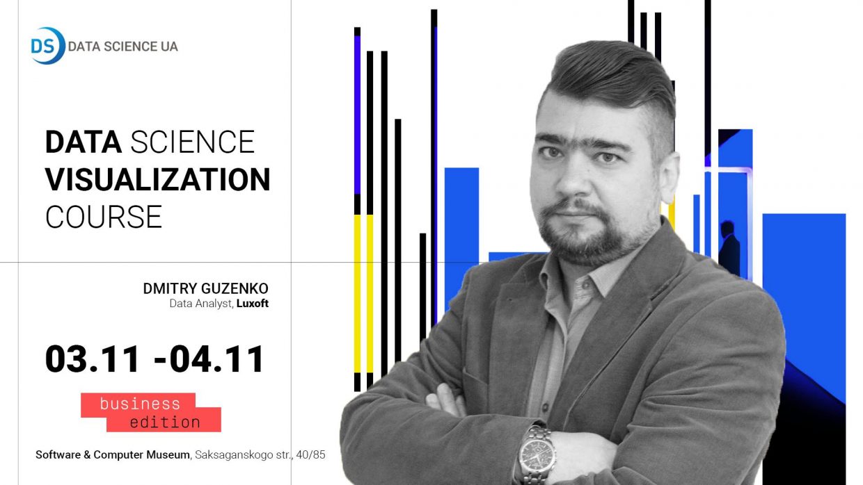
Data Science Visualization Course

Dmitry Guzenko

November 3 - 4

from 10:00 am till 6:00 pm

Software & Computer Museum

Saksaganskogo str., 40/85

Facebook

Data analysts, top executives, executives and Data Scientists – these categories of professionals understand the value of data visualization like no other.

November 3-4 Data Analyst Dmitry Guzenko will hold a two-day Data Science Visualization course.
Dmytro has over 20 years of experience in business process automation and ERP implementation, 10 years of experience in system analysis and business model architecture, 3 years of data management expertise to improve company performance.
He has experience in solutions architecture, business analysis and can tell everything about best practices to increase investor value.

Course content

  • Introduction to data visualization
  • Best practices and visualization techniques
  • Comparison of free platforms for data visualization
  • Workshop: simulation of visualization based on business requirements
  • Practical work: developing and publishing visualizations performed using MS Power BI Desktop, QlikView Personal Edition, Tableau Desktop Public Edition
  • R Visualization Development Practices, ggplot libraries, ggplot2, rgl, plotly
  • The practice of developing Python visualization, the matplotlib library, plotly, bokeh

In the course you will find the answers to the questions:

  • Practices and approaches for qualitative visualization. What mistakes should be avoided? How to make the data speak for itself and show the necessary insights?
  • What does the term Self BI mean?
  • How to render the visualization fast without programming and give others access to the created visualization within the organization or even beyond its borders?
  • How to do it with such tools, for the use of which companies would not have to pay money, or the cost would be very affordable, and the result is highly professional?

The course is designed to provide practical skills for all participants in the course and teach you to work with three systems: Microsoft Power BI, QlikView, and Tableau.
These are recognized leaders in visualization. Ability to use them is a necessary skill for a modern specialist.

The course is based on the study of officially free products available to everyone:

  • MS Power BI Desktop
  • QlikView Personal Edition
  • Tableau Desktop Public Edition

Also, for Data Science and machine learning projects, a deeper analysis of data is required, which is implemented with the help of R and Python tools. Part of the course is devoted to the study of some basic visualization capabilities using popular R and Python libraries.
For whom the course was developed:

  • For executives and top managers who want to understand their data and develop their own reports
  • IT professionals, business analysts and data analysts who want to understand the capabilities, benefits and limitations of the three most popular visualization systems: Power BI, QlikView, Tableau
  • Data Scientists, developers who want to speed up and simplify the process of interaction with customers, respond faster to changing business requirements, spend less time on obtaining a valuable product and seek more insights with minimal cost.
Requirements for participants:
  • Basic knowledge of data structures
  • Basic knowledge of English
  • Skills and experience with Excel
  • Laptop
  • Implementation of the first laboratory installation work in accordance with the given instruction

Course program

November 3

Block 1. Introduction to data visualization

  • History of visualization, examples of historically significant visualization work
  • Common architectures for data processing, analysis and visualization systems
  • Forecasting and visualization in Data Science projects
  • General requirements for visualization systems
  • Comparison of the best visualization systems
  • Typical mistakes
  • Best practices and guidelines for developing high-quality visualizations

Block 2. Planning and implementation of data visualization projects

  • Approaches to the organization of visualization projects
  • Practice: working in groups, developing a visualization prototype according to business requirements

Block 3. Working with Microsoft Power BI for data visualization

  • About Power BI products
  • Installation, system setup
  • Import data from various sources
  • Pre-processing of data
  • Data aggregation and model development
  • Practice: Import and pre-processing

Block 4.

  • Use of additional data functionality
  • Reporting using standard items
  • Developing reports using advanced visual capabilities
  • Publication of reports for employees of the organization
  • Publication of reports on the Internet for public access
  • Practice: publishing reports
November 4

Block 5. Work with the QlikView Personal Edition system for data visualization

  • About QlikView products
  • Installation, system setup
  • Import data from various sources
  • Pre-processing of data
  • Data aggregation and model development
  • Practice: Import and pre-processing
  • Use of additional data functionality
  • Reporting
  • Publication of reports on the Internet for public access
  • Practice: Developing and publishing reports

Block 6. Working with the Tableau Desktop Public Edition system for data visualization

  • About Tableau Products
  • Installation, system setup
  • Import data from various sources
  • Pre-processing of data
  • Data aggregation and model development
  • Practice: Import and pre-processing
  • Use of additional data functionality
  • Reporting
  • Publication of reports
  • Practice: Developing and publishing reports

Block 7. Use of R language for visual data analysis

  • Setting Power BI to use R
  • Opportunities for research using R
  • Important functions for analyzing data from ggplot libraries, ggplot2, rgl, plotly
  • Practice: build Power BI reports using language features R

Block 8: Use Python to visualize data

  • Setting up Power BI to use Python
  • Python research capabilities
  • Important functions for data analysis from libraries matplotlib, plotly, bokeh
  • Practice: build Power BI reports using Python language features
  • Conclusion and further steps