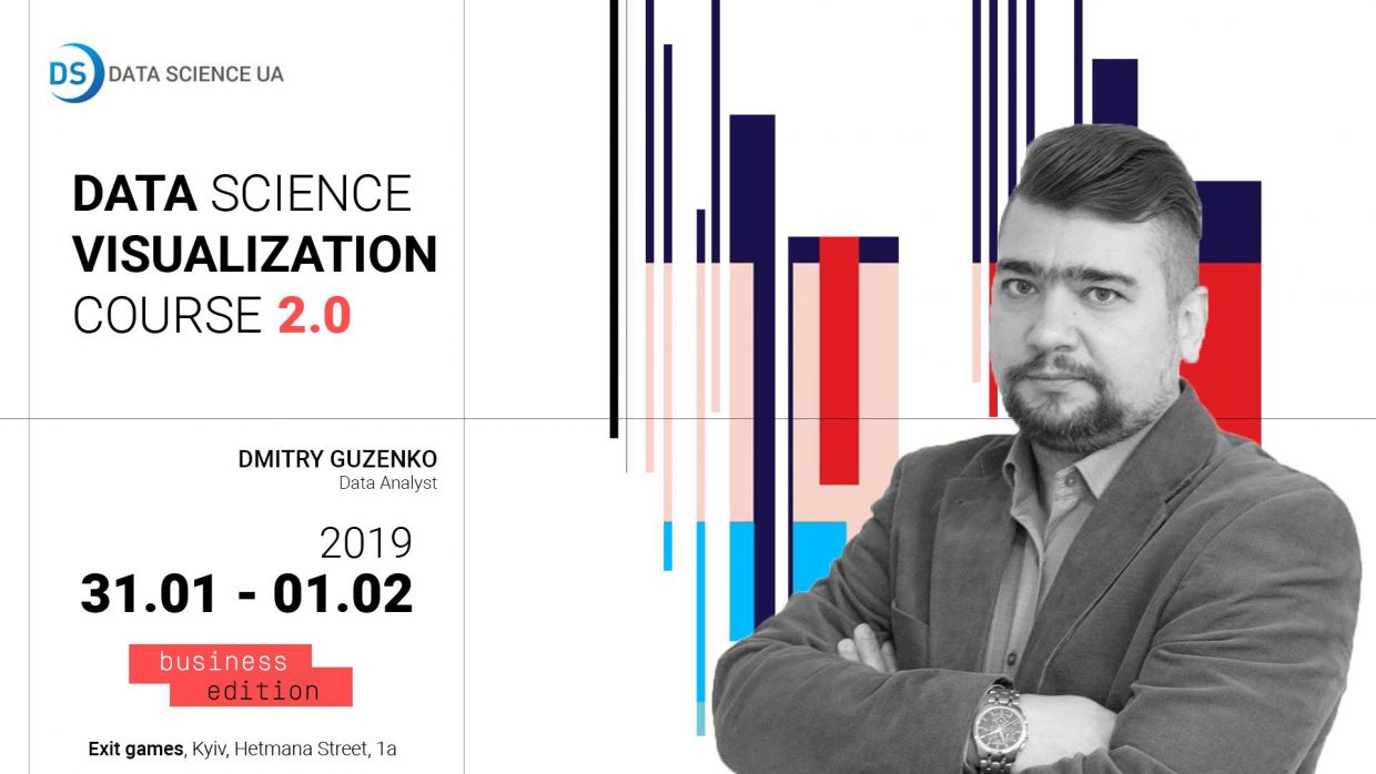
Data Science Visualization Course: 2.0

Dmitry Guzenko

January 31 - February 1

from 10:00 am till 6:00 pm

ExitGames

1А, Vadyma Hetmana st

Facebook

Data analysts, top executives, executives and Data Scientists – these categories of professionals understand the value of data visualization like no other.

January 31 – February 1, Data Analyst Dmitry Guzenko will hold a two-day Data Science Visualization course.

More than 20 years of experience in business process automation & ERP systems implementation, 10 years of experience in system analysis and business models architect, 3 years expertise in Data Management approach to improve company efficiency.
Course content

• Introduction to data visualization
• Best practices and methods for data visualisation
• Comparison of free data visualization platforms
• Workshop in groups: modeling visualization based on business requirements
• Practical work: development and publication of visualizations made using MS Power BI Desktop, Tableau Desktop Public Edition
• Practical work: development of R rendering, ggplot2 library, RGL, Plotly
• Practical work: development of Python visualization, matplotlib library, plotly, bokeh

In the course you will find the answers to the questions:

• Practices and approaches for quality visualization. What mistakes should be avoided? How to make the data speak for themselves and show the necessary business insights?
• Self BI systems overview
• How to make visualization quickly, without programming, and give others access to the generated visualization, within the organization or even beyond?
• How to make it a tool that companies would not have to pay money for or the value would be very affordable?

You will gain practical skills in Microsoft Power BI and Tableau.

Also, Data Science and machine learning projects require a deeper analysis of data that is implemented using R and Python. Part of the course is devoted to exploring some basic imaging capabilities using popular R and Python libraries.

For whom the course was developed:

• for executives and top managers who want to understand their data and design the boards and reports themselves;
• IT professionals, business and data analysts seeking to understand the capabilities, benefits and limitations of the 2 most popular imaging systems: Power BI, Tableau;
• Data Scientists, developers who want to speed up and streamline customer engagement, respond quickly to changing business requirements, spend less time getting a valuable product, and get more insights with minimal cost.

Запрошенi спiкери

Alexandr Vasiliev

DataStream

Dmytro Patsiliandra

Chief Instrument Technician / Party Manager ,Vestland Offshore AS

Course program

January 31

Block 1. Introduction to data visualization

  • History of visualization, examples of historically significant visualization work
  • Common architectures for data processing, analysis and visualization systems
  • Forecasting and visualization in Data Science projects
  • General requirements for visualization systems
  • Comparison of the best visualization systems
  • Typical mistakes
  • Best practices and guidelines for developing high-quality visualizations

Block 2. Planning and implementation of data visualization projects

  • Approaches to the organization of visualization projects
  • Practice: working in groups, developing a visualization prototype according to business requirements

Block 3. Working with Microsoft Power BI for data visualization

  • About Power BI products
  • Installation, system setup
  • Import data from various sources
  • Pre-processing of data
  • Data aggregation and model development
  • Practice: Import and pre-processing

Block 4. Microsoft Power BI reports' creation

  • Use of additional data functionality
  • Reporting using standard items
  • Developing reports using advanced visual capabilities
February 1

Block 5. Publication of reports

  • Publication of reports for employees of the organization
  • Building a SharePoint Analytics Center
  • Setting permissions for dashboards and reports
  • Publication of reports on the Internet for public access
  • Practice: Developing an analytics publication in different scenarios

Block 6. Working with the Tableau Desktop Public Edition system for data visualization

  • About Tableau Products
  • Installation, system setup
  • Import data from various sources
  • Pre-processing of data
  • Data aggregation and model development
  • Practice: Import and pre-processing
  • Use of additional data functionality
  • Reporting
  • Publication of reports
  • Practice: Developing and publishing reports

• Практика: Розробка і публікація звітів

Block 7. Use of R language for visual data analysis

  • Setting Power BI to use R
  • Opportunities for research using R
  • Important functions for analyzing data from ggplot libraries, ggplot2, rgl, plotly
  • Practice: build Power BI reports using language features R

Block 8: Use Python to visualize data

  • Setting up Power BI to use Python
  • Python research capabilities
  • Important functions for data analysis from libraries matplotlib, plotly, bokeh
  • Practice: build Power BI reports using Python language features
  • Conclusion and further steps